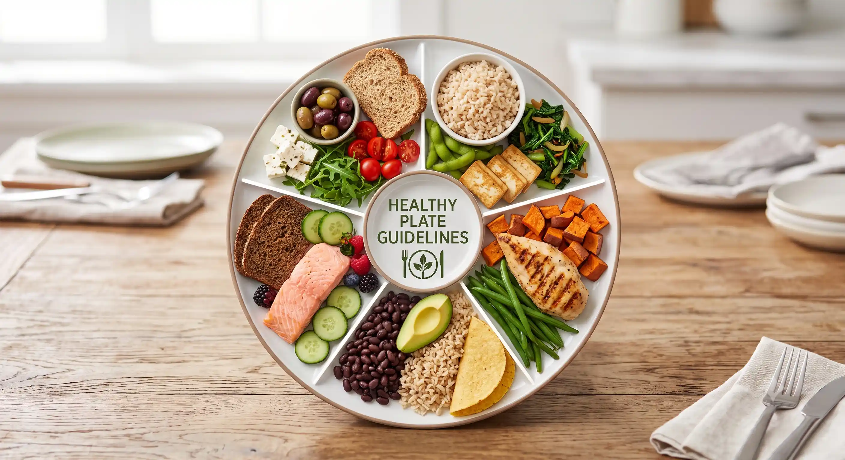
Every country that publishes official dietary guidance ends up answering the same question: how should a person divide their plate? The answers are more different than you'd expect — and more similar than the packaging suggests.
Some governments draw a plate split into quadrants. One draws a spinning top with a person jogging through the middle of it. One doesn't draw a plate at all, and instead organises its entire guidance around how processed your food is. Comparing six of these official guides side by side is a useful exercise for a reason that has nothing to do with trivia: it shows you which "rules" of healthy eating are genuinely load-bearing, and which ones are just local habit dressed up as science.
United States — MyPlate
A plate divided into four quadrants: vegetables and fruits make up half the plate (vegetables slightly larger than fruit), grains and protein make up the other half (grains slightly larger than protein), with a small blue circle beside the plate representing a serving of dairy. MyPlate replaced the food pyramid specifically because research showed people found a plate easier to translate into an actual meal than a stacked triangle of food groups.
The core instructions: make half your plate fruits and vegetables, make at least half your grains whole grain, vary your protein sources instead of defaulting to the same one every day, and choose low-fat or fat-free dairy. It's deliberately simple — MyPlate is aimed at a general population with wide-ranging nutrition literacy, not a clinical or athletic audience.
United Kingdom — The Eatwell Guide
A circular plate divided into five sections: just over a third starchy carbohydrates (bread, rice, potatoes, pasta — wholegrain or higher-fibre versions preferred), just over a third fruit and vegetables, a moderate section for dairy or dairy alternatives, a smaller section for protein (beans, pulses, fish, eggs, meat), and a small amount of unsaturated oils used sparingly. The Eatwell Guide also specifies fluid intake directly — 6 to 8 glasses of water a day — and tells people to eat foods high in fat, salt, and sugar less often and in small amounts, rather than banning any category outright.
Two details make the UK's guide distinct from the US version: it explicitly asks people to eat more beans and pulses (not just "protein"), and it names sustainable fish sourcing and portion frequency for red and processed meat directly in the guidance rather than leaving it implied.
India — ICMR-NIN's "My Plate for the Day"
Half the plate is vegetables and fruits, with an explicit push toward green leafy vegetables specifically, not just "vegetables" generically. One quarter is cereals and millets — and the 2020 revision was notably direct about shifting that quarter away from polished rice and refined wheat toward millets like jowar, bajra, and ragi, years before India's UN-declared International Year of Millets in 2023. The final quarter is pulses, legumes, eggs, or flesh foods, alongside a katori of curd or a glass of milk and a small quantity of fats, oils, and nuts.
The structural difference from MyPlate isn't really the proportions — they're close. It's the format. India's guideline is built around a thali and katori (small bowl) system rather than Western plate geometry, because that's how a majority of Indian meals are actually served. It's also the only one of the six guides in this comparison that treats dal and other pulses as a default primary protein source rather than a secondary or vegetarian-substitute option — and for a practical sense of what that looks like on a plate, 30g protein Indian breakfast ideas show how easily that protein target is met without any chicken or supplementation.
Japan — The Food Guide Spinning Top
Jointly issued by Japan's Ministry of Health, Labour and Welfare and Ministry of Agriculture, Forestry and Fisheries, this is the one guide in the comparison that abandons plate geometry entirely. It's shaped like a koma — a traditional spinning top — with recommended servings decreasing as the tiers narrow toward the bottom: staple grains (rice, bread, noodles) form the widest tier at the top, vegetables come next, then main dishes (fish, meat, eggs, soy), with milk/dairy and fruit occupying two small tiers near the tip.
The genuinely distinctive feature: a human figure, drawn walking or jogging, runs through the top as its axis — representing physical activity as the thing that literally keeps the whole diet "spinning" and balanced. It's not a footnote about exercise; it's structural to the diagram. Water and tea form the axis itself, and a small string wound around the top, drawn near the tip, represents confectionery and alcohol — optional, small, and explicitly outside the main structure rather than integrated into it.
Canada — Canada's Food Guide (2019 redesign)
Canada's 2019 rewrite dropped the traditional four food groups and serving-size counting entirely. What replaced it: a plate that's roughly half vegetables and fruits, a quarter whole grain foods, and a quarter protein foods — with an explicit push toward plant-based protein (legumes, nuts, tofu) being eaten as often as animal protein. Dairy lost its status as a mandatory standalone category; milk and yogurt now appear simply as options within the protein and beverage sections. Water is named directly as "the drink of choice." You can see the current version at food-guide.canada.ca.
What makes this one genuinely interesting beyond the plate itself: the redesign process was developed with an explicit policy limiting food-industry consultation, in contrast to the 2007 version, which was shaped with closer input from dairy, meat, and grain producer groups. Nutrition researchers at the time pointed to it as a rare example of a government dietary guideline being rewritten specifically to reduce industry influence on the final recommendations.
Brazil — Dietary Guidelines for the Brazilian Population
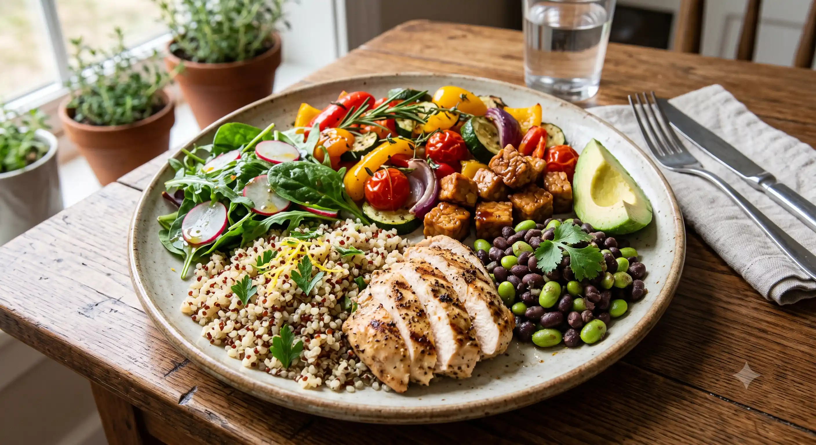
Brazil's guide is the outlier of the six, and deliberately so. There is no plate, no food groups, and no serving sizes. Instead, the entire guideline is organised around degree of processing: eat mostly natural or minimally processed foods (fruit, vegetables, grains, legumes, meat, milk, eggs); use oils, fats, salt, and sugar in small amounts, mainly for cooking and seasoning; limit processed foods (canned vegetables in brine, cheese, freshly-made bread); and avoid ultra-processed foods — soft drinks, packaged snacks, instant noodles, reconstituted meat products — rather than simply moderating them.
This guide is the origin of the NOVA food classification system, which sorts food by processing level rather than nutrient content (Monteiro et al., 2016). The World Health Organization and several other national guidelines — Uruguay, Ecuador, Peru, and others — have since adopted some version of the NOVA framework for their own guidance or front-of-pack warning labels. If you want a practical starting point for applying processing-level thinking to your own shopping, what 'natural flavours' actually means on a food label is a useful illustration of how processing hides in plain sight on ingredient lists. Brazil's guide also uniquely treats the social context of eating — meal times, cooking skills, eating with others rather than alone in front of a screen — as dietary guidance in its own right, not a lifestyle footnote.
Six Guides, Side by Side
| Country | Format | Veg + fruit share | Protein approach | Most distinctive feature |
|---|---|---|---|---|
| USA | Quartered plate + dairy circle | ~50% | Vary sources; separate dairy serving | Simplicity — built for general literacy |
| UK | Five-section circular plate | ~35%+ | Beans/pulses named directly; limit red meat | Names fish sustainability and fluid intake explicitly |
| India | Thali/katori-based plate | ~50% | Pulses as default primary protein | Explicit push from refined grains to millets |
| Japan | Tiered spinning top, no plate | 2nd-largest tier | Fish, meat, eggs, soy in one tier | Physical activity built into the diagram as its axis |
| Canada | Simplified 3-zone plate | ~50% | Plant protein encouraged equally with animal | Dairy no longer a mandatory separate group |
| Brazil | No plate — processing-level tiers | Part of "minimally processed" tier | Not portioned; judged by processing level | Origin of the NOVA classification system |
Where They All Agree
Strip away the format — plate, spinning top, processing tier — and four principles show up across every single one of these six guides, issued independently by six governments with different food cultures, agricultural lobbies, and public health priorities.
- Vegetables and fruit get the largest or joint-largest share. The US, India, and Canada all land on roughly half the plate. The UK's Eatwell Guide puts it just over a third, tied with starchy carbohydrates for the largest section. None of the six guides gives protein or grains a larger share than vegetables and fruit.
- Whole or minimally processed carbohydrate sources are preferred over refined ones. Whole grain in the US and UK, millets in India, brown rice implicit in Japan's staple-grain tier, whole grain foods explicitly in Canada, and "minimally processed" as a defining category in Brazil.
- Protein is a moderate portion, not the plate's dominant feature — and plant protein is explicitly encouraged. Dal in India, beans and pulses named directly in the UK, legumes and tofu promoted equally with meat in Canada, soy grouped with fish and meat in Japan's main-dish tier.
- Water is the named default beverage, and sugary drinks or alcohol sit outside the "everyday" structure in every guide. The UK names glasses of water directly; Canada calls it "the drink of choice"; Japan draws water and tea as the guide's literal axis; Brazil places sugary and alcoholic drinks outside its "natural and minimally processed" tier entirely.
None of these six guidelines ask you to count calories. They describe proportion, food quality, and processing level instead — which is part of why calorie counting alone tends to fall short as a long-term strategy for eating well.
Where They Genuinely Differ
The disagreements are just as informative as the agreements, because they show you which parts of "healthy eating" are actually contested or culturally specific rather than settled.
- Dairy's status. Mandatory, separate category in the US and (to a lesser extent) the UK. Optional and folded into other categories in Canada's 2019 guide. Not really a distinct plate category at all in India, Japan, or Brazil — present in the diet, but not structurally called out the same way. The dairy options that do appear across all six guides (yogurt, kefir, cultured milk) tend to be fermented; for what the evidence actually says about those, see fermented foods and gut health.
- Whether physical activity is part of the diagram. Japan is the only one of the six that visually builds movement into the guide itself, rather than issuing it as separate advice alongside the food guidance.
- Plate geometry versus no geometry at all. Five of the six guides use some version of a plate or pie-chart visual. Brazil abandons plates and food groups completely in favour of a processing-level framework — arguably the single biggest philosophical difference in this entire comparison.
- How much industry shaped the guidance. Canada's 2019 rewrite is the notable case of a government explicitly limiting food-industry input while drafting a dietary guide, a contrast to older guides — including Canada's own 2007 version — developed in closer consultation with dairy, meat, and grain producer groups.
What to Actually Do With This
You don't need to pick a national guideline and follow it to the letter — you need the handful of principles that six independent governments agree on, applied to whatever cuisine you actually cook and eat. In practice, that means: build most meals around a plate that's at least a third to half vegetables and fruit, choose a protein source you'd be comfortable eating even without meat available (dal, beans, tofu, eggs, fish), pick the less-refined version of whatever carbohydrate you're already eating, keep added oils and sugary drinks to a small, deliberate amount rather than a default, and treat water as the boring, correct answer to "what should I drink with this."
If you want a concrete, hand-measured version of this same structure — one that doesn't require a food scale or picking a country's guideline to follow — the framework in How to Build a Balanced Plate Without a Food Scale translates all six of these guides' shared principles into palm, fist, cupped-hand, and thumb portions you can apply at any meal, in any cuisine. If you want to put those principles into a weekly rhythm, the 2-hour Sunday reset is a practical meal-prep framework built around exactly these proportions.
None of this requires abandoning the food you grew up eating in favour of a diagram designed for a different country's supermarket shelves. The point of comparing six official guides side by side isn't to find the "correct" one — it's to notice that the correct principles were never really about MyPlate, or the Eatwell Guide, or any single national brand of common sense. They show up everywhere, because they're closer to biology than to culture.